
Clean Transformation
Prompt
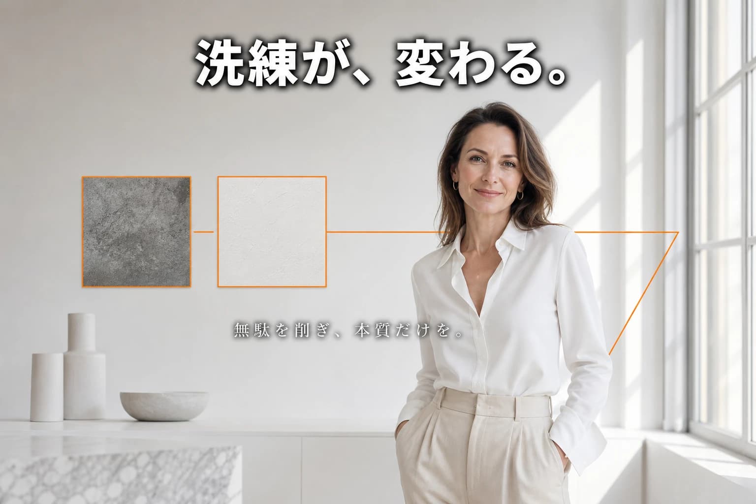
16:9 landscape, editorial fashion magazine style banner with real-life photography quality. A sophisticated woman in her mid-40s, Caucasian, with a relaxed confident pose, wearing a crisp white blouse and tailored beige trousers, stands in a bright white studio with a large window letting in soft natural daylight. On the left side of the image, a subtle before/after tile comparison showing two small abstract textured squares (one darker grey, one clean white). The overall color palette is monochrome with a single pop of fluorescent orange accent used only for a thin geometric line and the small tile frames. Lighting is bright, clean, and airy. At the top center, bold white text with a strong dark outline reads: "洗練が、変わる。" In the lower center, a small sub-line in Japanese in a lighter weight: "無駄を削ぎ、本質だけを。" The woman looks naturally toward the camera, skin texture is real, shot on a medium format camera with shallow depth of field. No logos, no URLs, no watermarks, no English decorative text, only specified Japanese text is rendered.
このバナーはYouTubeサムネイルおよびSNS広告用の16:9横長フォーマットで設計されています。エディトリアル/雑誌グラビア風の撮影スタイルと洗練された40代女性の起用により、高級感と審美眼の良さを伝え、プレミアムサービスや高品質プロダクトのブランディングに最適です。モノクロ基調に蛍光オレンジをBefore/After比較タイルにのみ配することで、清潔感と強いコントラストを生み、変化・改善・洗練を直感的に訴求します。
明るく爽やかな自然光と広めの余白は、透明性・清潔感・モダンな美学を象徴。Before/After要素はあくまで控えめに配置し、バナー全体の散らかりを防ぎながらも、強力なメッセージ性を保持しています。配色はモノクロ+ワンポイントオレンジと極限まで絞ることで、情報過多なSNSタイムラインでも視認性が高く、かつエレガントで信頼感のあるエディトリアルな印象を与えます。
Prompt Overview
This banner is designed for YouTube thumbnails and SNS advertisements in a 16:9 format. The editorial photography style with a sophisticated woman conveys a sense of high quality and refined taste, ideal for luxury service brands or premium product launches. The monochrome base with a striking fluorescent orange accent on the before/after comparison tiles creates a clean, high-contrast visual that immediately signals transformation and professionalism.
The bright, airy lighting combined with generous white space communicates transparency, cleanliness, and a modern aesthetic. The before/after element is subtly integrated to avoid clutter while still delivering a powerful message of improvement. The color scheme—monochrome plus a single pop of orange—ensures the banner stands out in busy social feeds while maintaining an elegant, editorial feel that builds trust and credibility.
Was this prompt helpful?
Comments
Comments appear after moderation