B2B SaaS 数据看板功能介绍横幅提示词示例【AI 生成·9:16 竖版 LP】
提示词
9:16 vertical LP main visual / Instagram Story style. A natural, warm, B2B SaaS dashboard feature introduction banner. Overall impression: inviting, trustworthy, clear, professional, organic. Background: soft beige with subtle wood grain texture, gentle natural light from upper left, warm green accents (e.g. potted plants or soft leaves). Color palette: beige (#F5E6D3) as main, warm green (#7CB342) as accent, dark brown (#3E2723) for strong text contrast. Key visual elements: a simple, stylized dashboard UI mockup (line graph, bar chart, pie chart icons) with a soft glow, a small plant silhouette, and a subtle light effect (lens flare or soft gradient). At top, large bold title「チームのデータを」. Center, most prominent:「見える化しよう」in large bold white text with a dark brown border. Below center: a friendly, minimal avatar icon (abstract person silhouette in warm grey, not detailed face). Extra text elements: small subtitle「B2B SaaS ダッシュボード」under title, and a call-to-action phrase「まずは無料トライアル」at bottom in green. Layout: top to bottom – visual summary + title, then center main catchphrase + avatar, then dashboard icons and CTA. Ensure high readability: large bold Japanese text, strong contrast (white text with thick dark border). Draw specified Japanese text exactly:「チームのデータを」「見える化しよう」「B2B SaaS ダッシュボード」「まずは無料トライアル」. No other letters, URLs, logos, watermarks, or English decorative text.
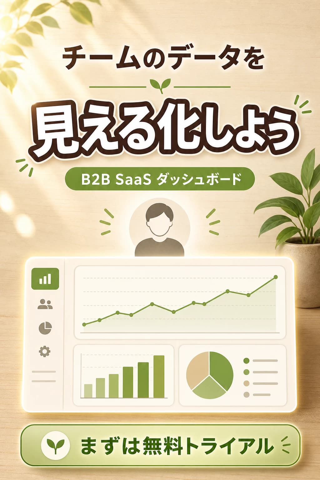
このバナーはB2B SaaSダッシュボードの機能紹介向けで、縦長LPメインビジュアルやInstagramストーリーズ(9:16)に最適化されています。温かみのあるベージュの背景に木目テクスチャと柔らかなグリーンの観葉植物を配し、ナチュラルで信頼感のあるブランドイメージを演出。中央の「見える化しよう」というキャッチコピーが価値提案を即座に伝え、上部のタイトルから中央のアバター・ダッシュボードアイコン、下部のCTAへ視線を誘導します。
カラーパレットはベージュ(#F5E6D3)と温かみのあるグリーン(#7CB342)を基調とし、B2B領域でありがちな寒色系の無機質な印象を避け、親しみやすくオーガニックな雰囲気を強調。ダークブラウン(#3E2723)の縁取りで白テキストの可読性を担保し、ミニマルなアバターでキャラクター生成リスクを回避。グラフやチャートのアイコンでプロダクトカテゴリを明確に伝えつつ、すっきりとした構成を実現しました。
提示词解读
此横幅广告专为B2B SaaS仪表盘功能推广设计,针对纵向长页面主视觉及Instagram快拍(9:16)进行了优化。暖色调米色背景搭配木纹纹理与柔和绿色观叶植物,营造出自然且值得信赖的品牌形象。中央的“可视化”标语即时传达价值主张,引导视线从顶部标题、中央头像及仪表盘图标,最终落至底部CTA按钮。
色彩方案以米色(#F5E6D3)和暖绿色(#7CB342)为主调,避免了B2B领域常见的冷色系无机质感,强调亲切与有机氛围。深棕色(#3E2723)边框确保白色文字的可读性,极简头像设计规避了角色生成风险。通过图表和图形图标清晰传达产品类别,同时保持了简洁的布局结构。
这个提示对您有帮助吗?
评论
评论将在审核后显示
この記事が役に立ったら投げ銭で応援
Apple Pay / Google Pay / カード (Visa/Mastercard/JCB/Amex) / Link / Alipay / WeChat Pay 対応 · Stripeで安全に決済
開発者が選ぶ最強ツール集
運営者が毎日使っているツール・ガジェット 6選