
Light Layering
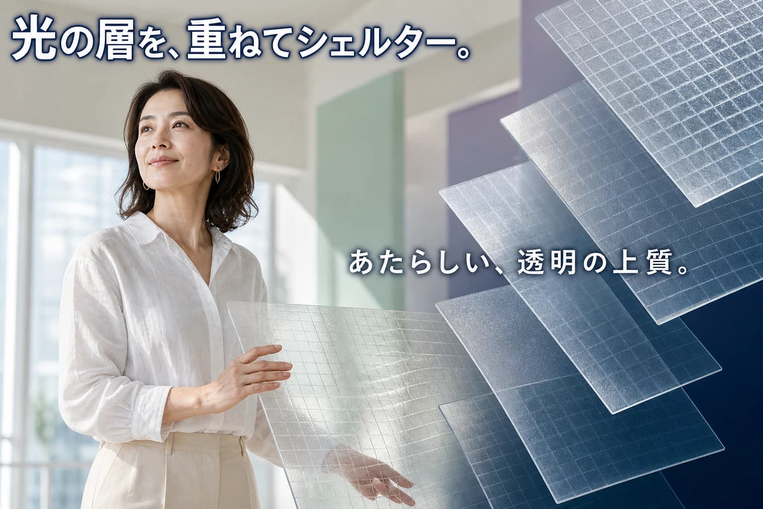
Prompt
16:9 horizontal YouTube thumbnail / SNS ad, editorial magazine photography style, featuring a single female model in her 40s, elegant and calm, with a softly confident expression looking slightly upward to the left. She wears a crisp white linen blouse and pale beige tailored trousers, her hands gently touching a translucent frost glass tile with a subtle bending grid pattern beneath. Background is a serene interior with large windows letting in soft natural daylight, walls are off-white with pale pastel mint green and lavender accents, wide empty space around the model. The tiles are arranged in a floating layered composition: deep navy gradient base layer with semi-transparent frosted glass tiles overlapping, creating a sophisticated sense of depth and lightness. Lighting is bright and airy, natural window light with soft fill from the right. Title in Japanese at the top left: 「光の層を、重ねてシェルター。」in large bold white font with a thin dark navy stroke for readability. Main tagline in the center-right: 「あたらしい、透明の上質。」in medium large semi-bold white text with a faint shadow. Layout: model on the left, tile accent on the right side, text carefully placed to avoid overlapping the model's face. Finish: photorealistic human with natural skin texture, shot on a 35mm DSLR. No logos, watermarks, or English decorative text. Only specified Japanese text is drawn.
このバナーは、建築材料ブランドのYouTubeサムネイルおよびSNS広告として設計され、濃紺グラデーションのベースにフロストガラスタイルが重なる上品な相互作用を表現しています。エディトリアル撮影スタイルと洗練されたライティングは静かな贅沢感と空間の静けさを伝え、建築家、インテリアデザイナー、高級住宅のオーナーなど、モダンな空間に洗練された仕上げを求める層をターゲットにしています。パステルカラーと広い余白は清潔で風通しの良いブランドイメージを強化し、人物要素が技術的な商品を憧れのライフスタイルイメージへと昇華させています。
40代の落ち着いた女性モデルを選ぶことで、ありふれた20代スリム美男美女の固定観念を避け、時代を超えたエレガンスと控えめなセンスを演出しています。自然光とソフトなパステルパレットは静けさと純粋さを呼び起こし、視覚的な散らかりのない聖域のような空間を暗示します。タイルの浮遊感ある重なり構成は奥行きと軽やかさを強調し、日本語コピー「光の層を、重ねてシェルター。」「あたらしい、透明の上質。」は、この製品を革新的でありながら感情に響くものとして位置づけています。
Prompt Overview
This banner is designed as a YouTube thumbnail and SNS ad for a design-forward architectural material brand, showcasing the elegant interplay of frosted glass tiles over a deep navy gradient base. The editorial photography style and refined lighting convey a sense of quiet luxury and spatial serenity, targeting architects, interior designers, and high-end homeowners seeking sophisticated finishes for modern spaces. The pastel accents and wide negative space reinforce the clean, airy brand identity, while the human element softens the technical product into an aspirational lifestyle image.
The choice of a mature female model in her 40s avoids the overused young slim archetype, aligning the product with timeless elegance and understated taste. The natural daylight and soft pastel palette evoke calmness and purity, suggesting that the tiles create a sanctuary-like atmosphere without visual clutter. The floating, layered composition of the tiles emphasizes depth and lightness, while the Japanese copy 'Light layering, a shelter built' and 'A new, transparent quality' position the product as both innovative and emotionally resonant.
Was this prompt helpful?
Comments
Comments appear after moderation