
Rhythm of Repetition
Prompt
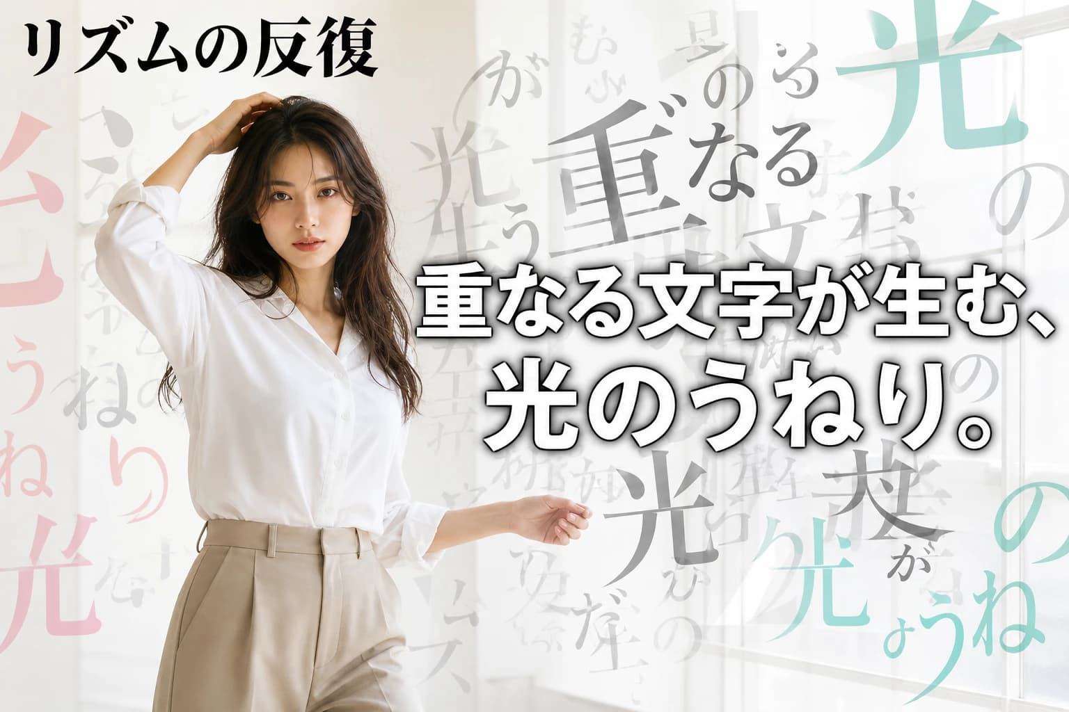
16:9 horizontal, a real-photo editorial style banner for YouTube thumbnail / SNS ad. A single female model in her late 20s, with a natural slim build, wearing a crisp white blouse and tailored beige trousers, stands confidently with a slight dynamic pose (one hand touching her hair, other arm slightly extended). She looks directly at the camera with a focused, sophisticated expression. The background is a clean, bright studio with off-white walls and diffused natural light from a large window; floating layers of semi-transparent black-and-white Japanese characters overlap in a rhythmic kinetic cascade, some large, some smaller, creating depth and motion. The overall tone is fresh, airy, and editorial: high-key lighting, soft pastel accents (pale pink or mint) subtly placed on a few character layers. Text: Top left corner "リズムの反復" in large bold Japanese, centered main headline "重なる文字が生む、光のうねり。" in strong white with a thin black outline. Layout: model slightly left of center, text blocks occupy the open right side and center. Real photographic quality, natural skin texture, shot on a 35mm DSLR. No logos, no English decorative text, only specified Japanese text.
このバナーはYouTubeサムネイルやSNS広告向けに、16:9横長・中央に大きな見出しを配置するデザインです。実写のエディトリアルモデルが洗練された雰囲気を演出し、半透明で反復する日本語文字が奥行きとリズムを生みます。白〜オフホワイト基調にパステルカラーを差し色にした明るく爽やかなトーンは、フィード上で高い可読性と清潔感、プレミアムな印象を与えます。
実写人物を据えることで抽象的なタイポグラフィに温かみが生まれ、「反復とリズム」というコンセプトが感情的にも伝わりやすくなります。レイアウトはモデルを左に、重なる文字を右〜中央に配置し、視線を人物からメッセージへ自然に誘導します。白・黒・赤の差し色・淡いパステルの配色は、明快さとモダンなエディトリアル感を強調し、クリエイティブ・デザイン関連のコンテンツ訴求に最適です。
Prompt Overview
This banner is designed for YouTube thumbnails and SNS ads, using a 16:9 horizontal format with a strong central headline. A real-photo editorial model conveys sophistication and focus, while overlapping semi-transparent Japanese characters create kinetic depth and rhythm. The fresh, airy tone—white/off-white base with subtle pastel accents—ensures high readability and a clean, premium feel that stands out in feeds.
The use of a live model anchors the abstract typography in human warmth, making the concept of 'repetition and rhythm' emotionally accessible. The layout balances the model on the left with layered text on the right, directing the eye from person to message. The chosen colors (white, black, red accent, pale pastel) reinforce clarity and a modern editorial aesthetic, ideal for creative/design-related content promotion.
Was this prompt helpful?
Comments
Comments appear after moderation